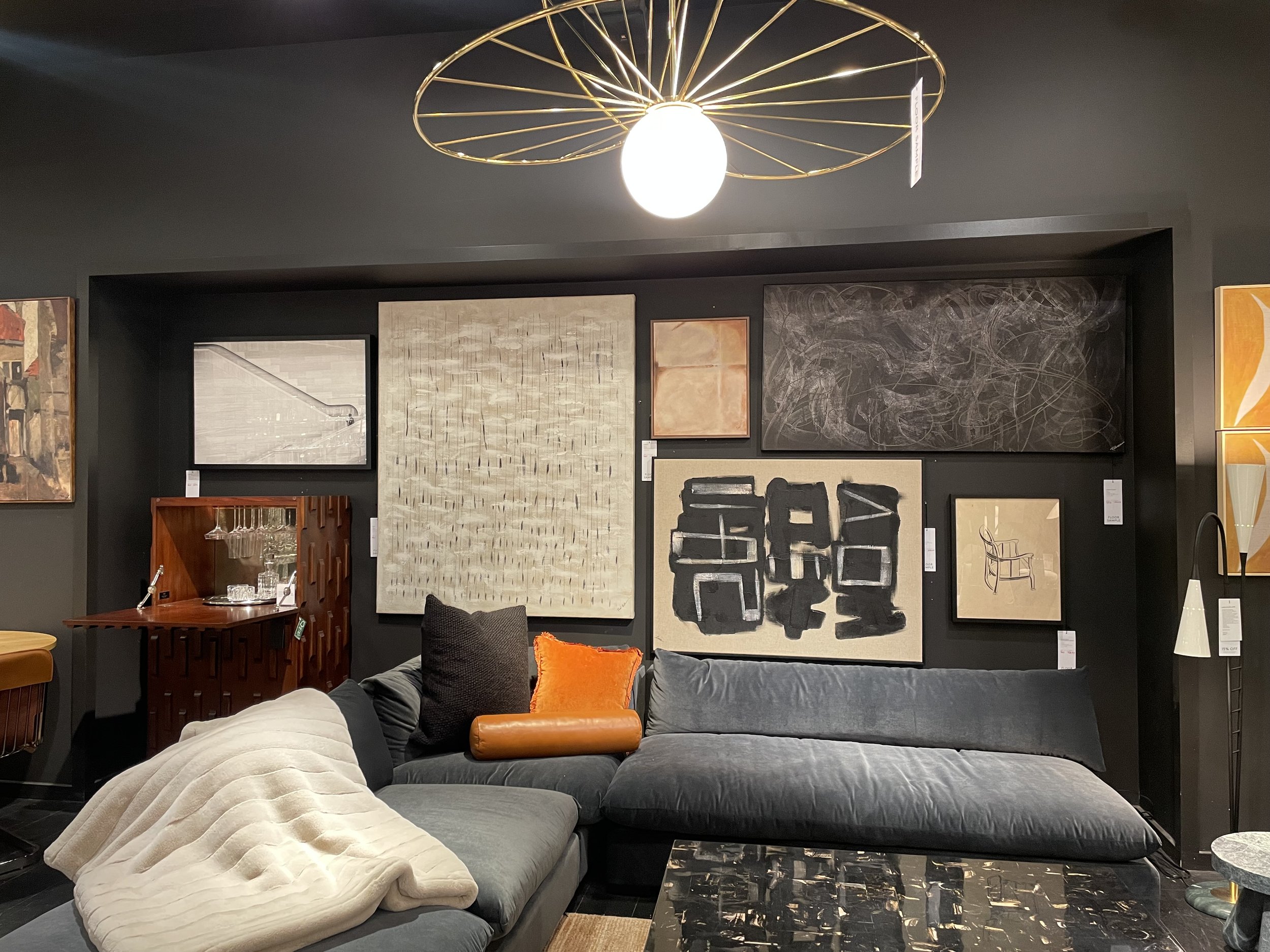
Visual Merchandiser
Bloomingdale’s King of Prussia location
February 2023-July 2025
I was hired as the Visual Merchandiser for the Men’s department, down below I have some photos of my visual work at Bloomingdale’s, I stayed with the company for 2 years.
Dressing/styling all of the mannequins on the men’s floor, including the ones for window display
Maintaining store standards, sizing, color coordinating, keeping things folded, etc.
Hanging signage for seasonal sales, putting up vinyl for exclusive trends and brand labeling
Using ladders, step stools, etc. to assemble in store and or window display decorations

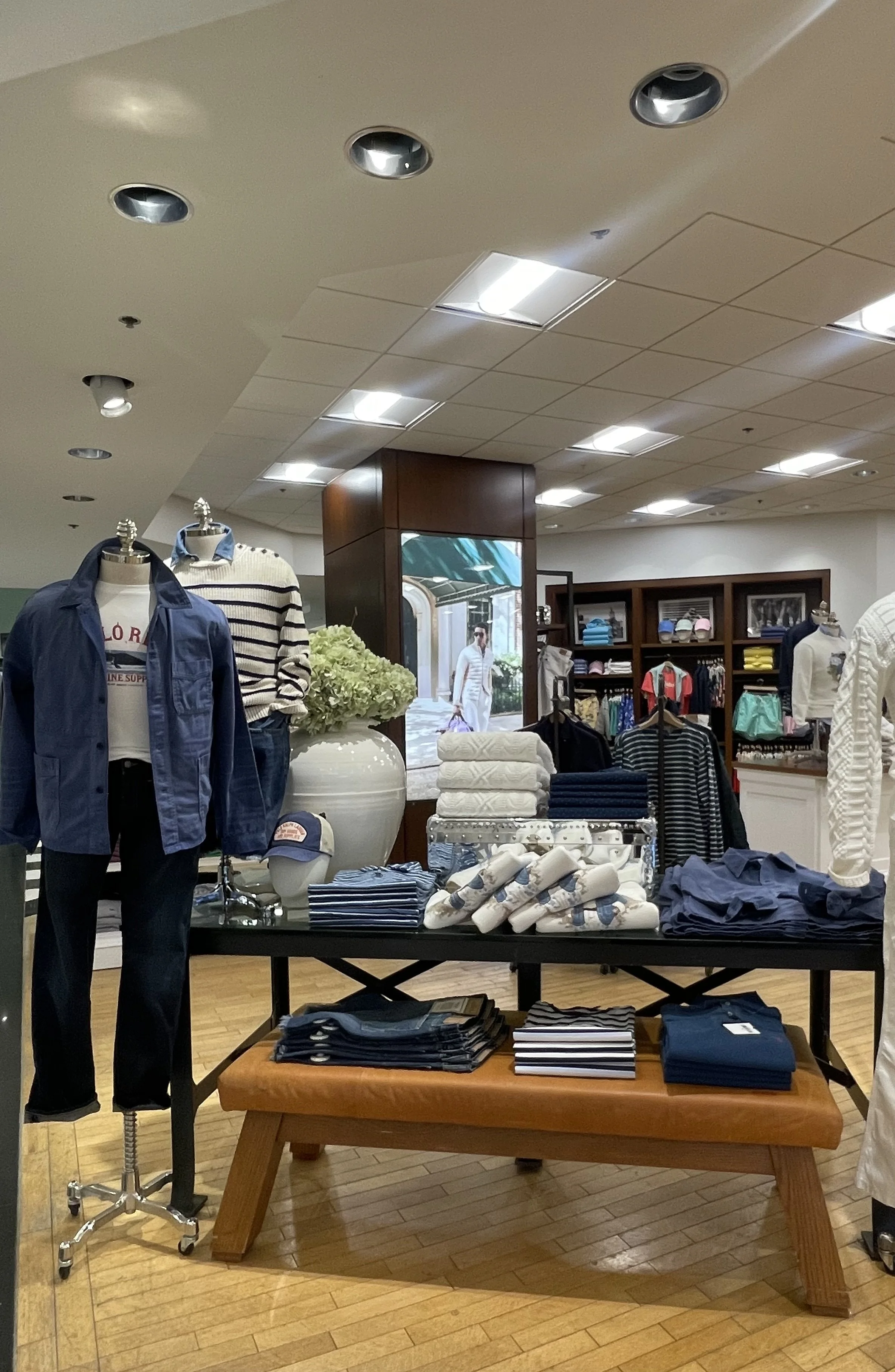
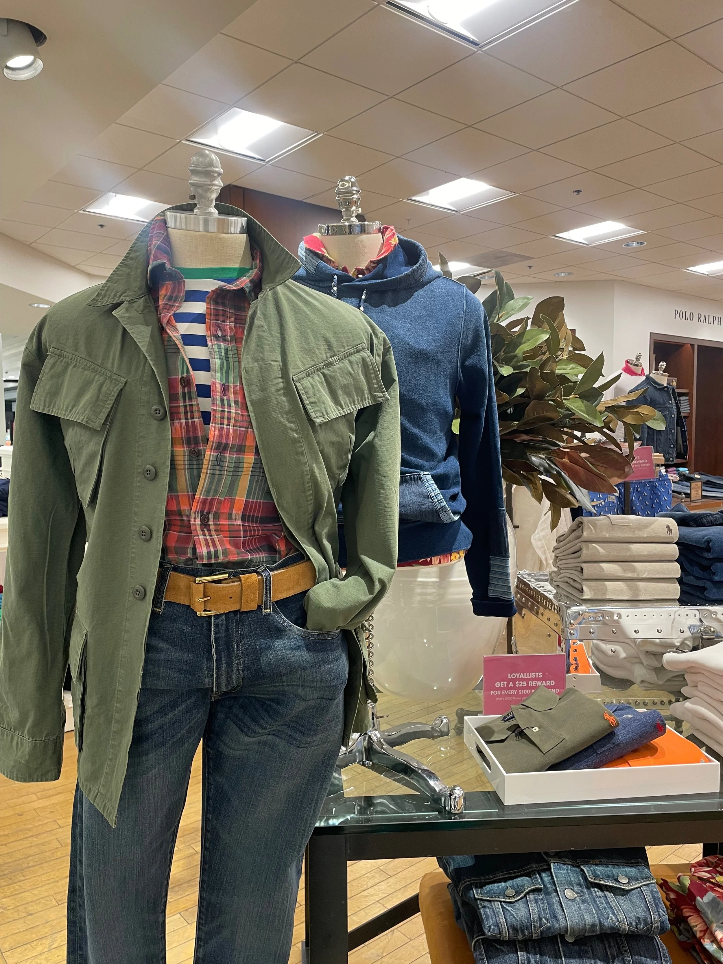
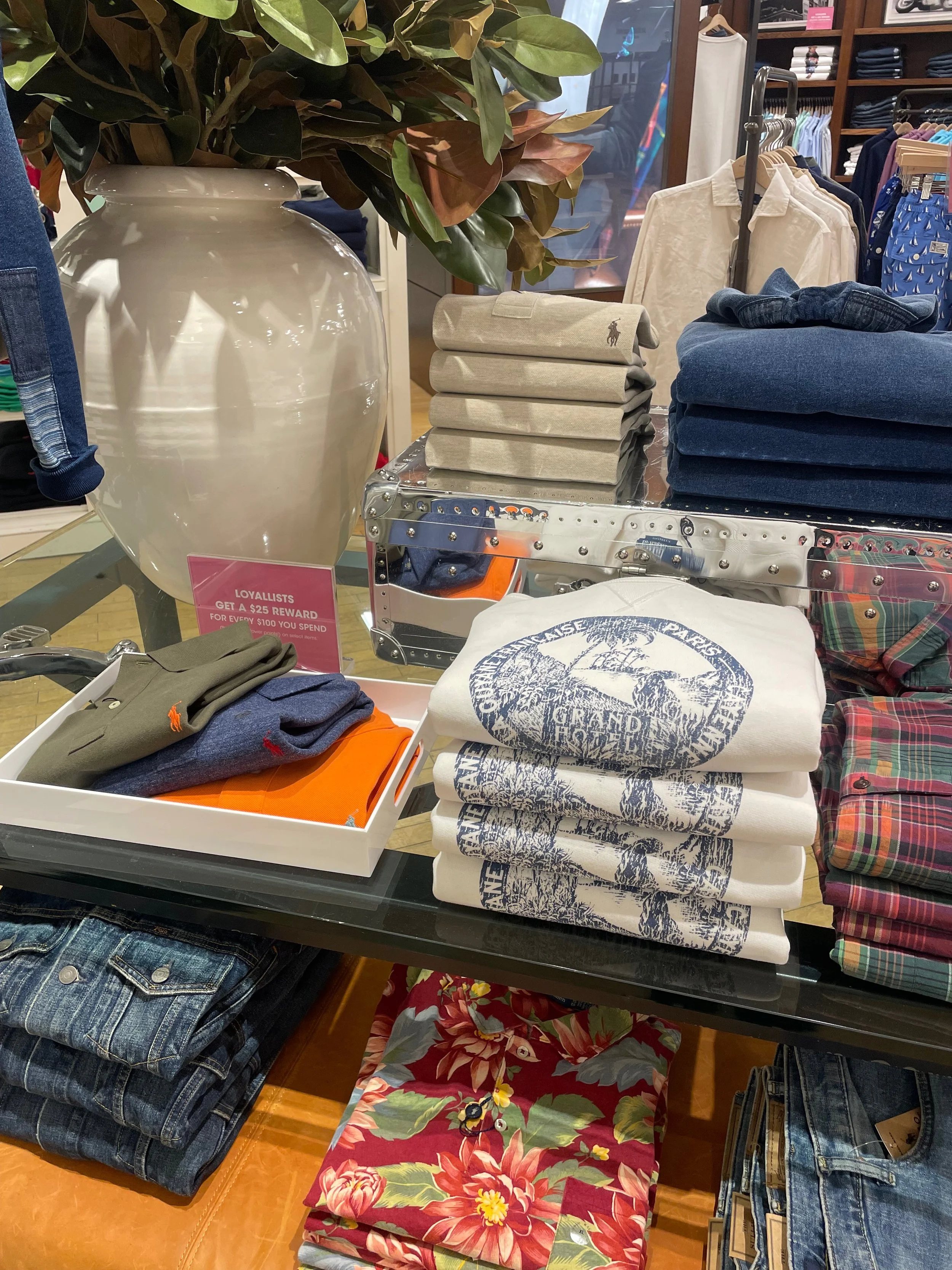
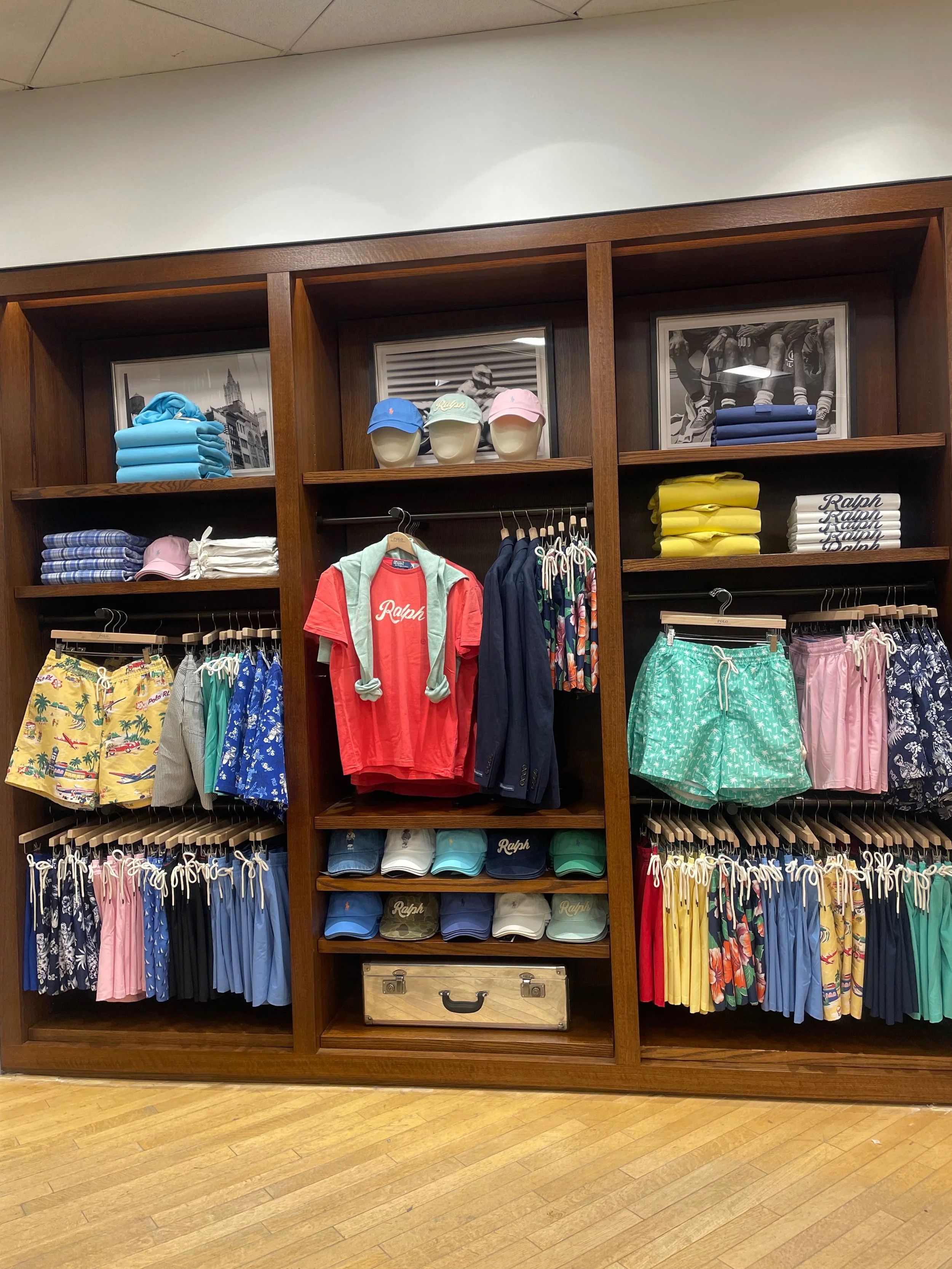
Understanding Standards: Polo RL
With Bloomindales being a luxury department store I’ve had experience with learning about the different visual standards for various brands such as Ralph Lauren.
Understanding how to do paper folds, layering and pinning for mannequin styling, color and style assortment, etc.
Down below are some photos of two different lifestyle tables I merchandised, as well as the swim wall in the bottom right corner.

Understanding Standards: Theory
Theory is another brand that I had to pay a lot of attention to when it came to standards, making sure that all the garments are sized, realizing that some shirts need to be quarter folded to show the detailing or the length of the sleeve, creating a color story that speaks to brand aesthetic, etc. Down below are some more photos of visual work for Theory.


Off To The Riviera
An inspiration from the costal glamour of French and Italian Riviera, this trend was all about embracing lightweight materials such as linen, cotton, and silk. For this trend I chose pieces from Ted Baker, Theory, The Men’s Store, Marine Layer and Hugo Boss.
I picked these outfits because it provides my customer with the option to see a look with and without shorts. Something that can be for during the day festivities and something that he could wear to a dinner later that evening. The stone shapes were also added to give more depth to the display.

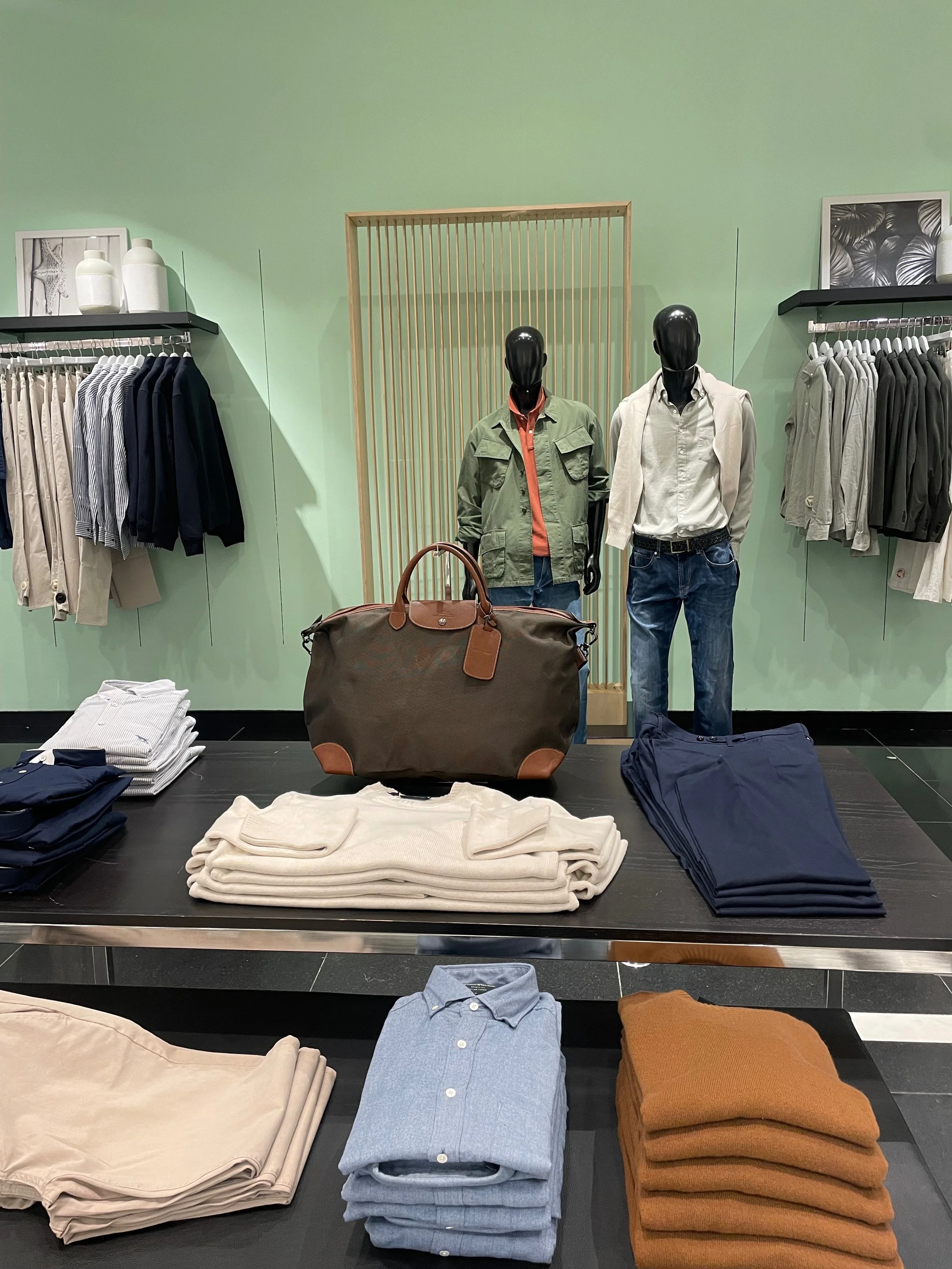
Heritage Classics
‘Heritage Classic’ was one of trend themes Bloomingdale’s wanted to display for Pre-Spring season. This trend was all about highlighting high quality timeless pieces such as button down shirts, blazers, light weight jackets, classic denim, etc.
I pulled all these pieces together to create this customer focal point for this trend. Given that Bloomingdale’s is a department store I was able to select garments from different brands that I felt complimented this concept.

Brands I selected for this trend; Rodd Gunn, Ted Baker, Boss & Peter Millar


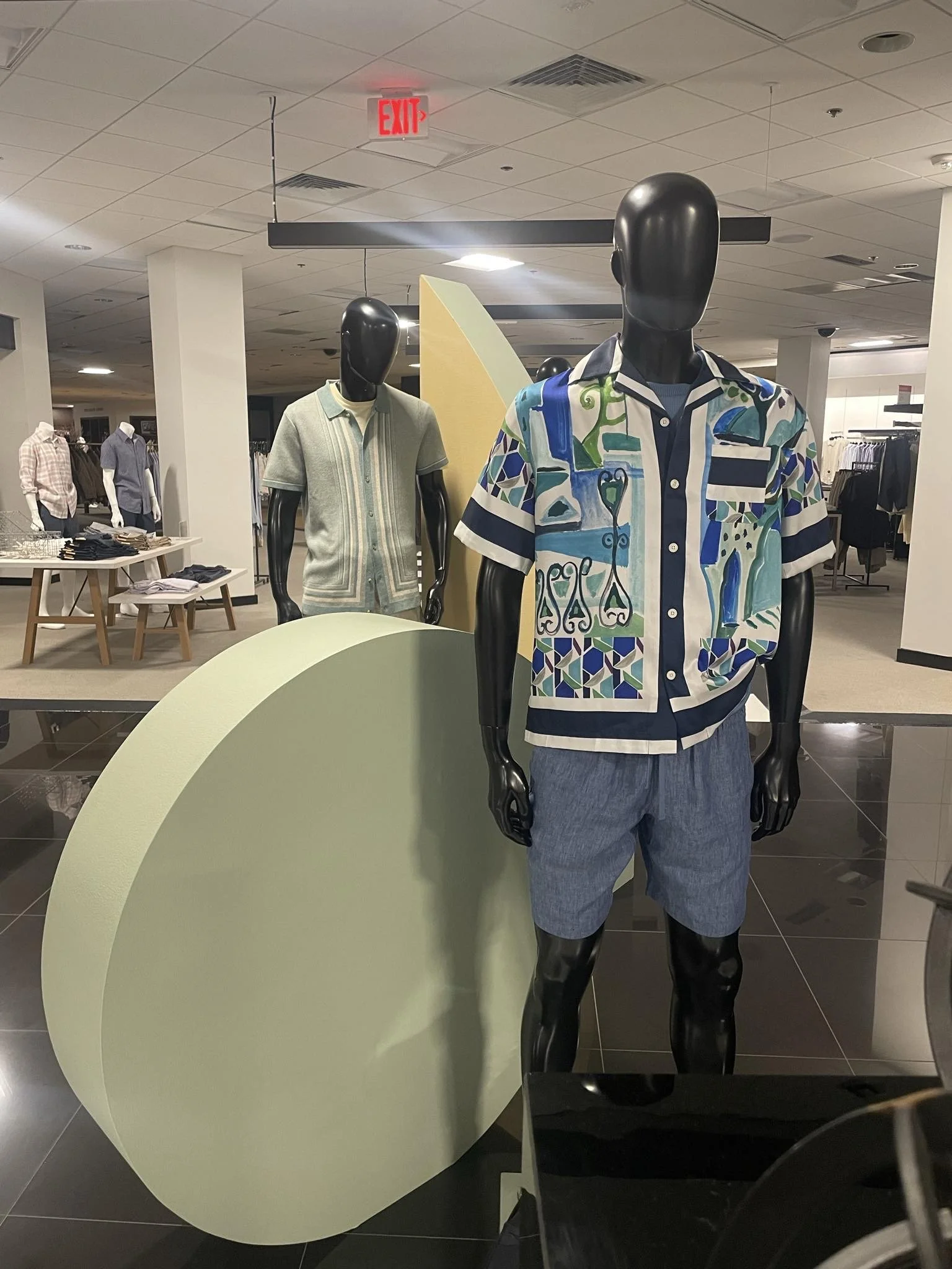
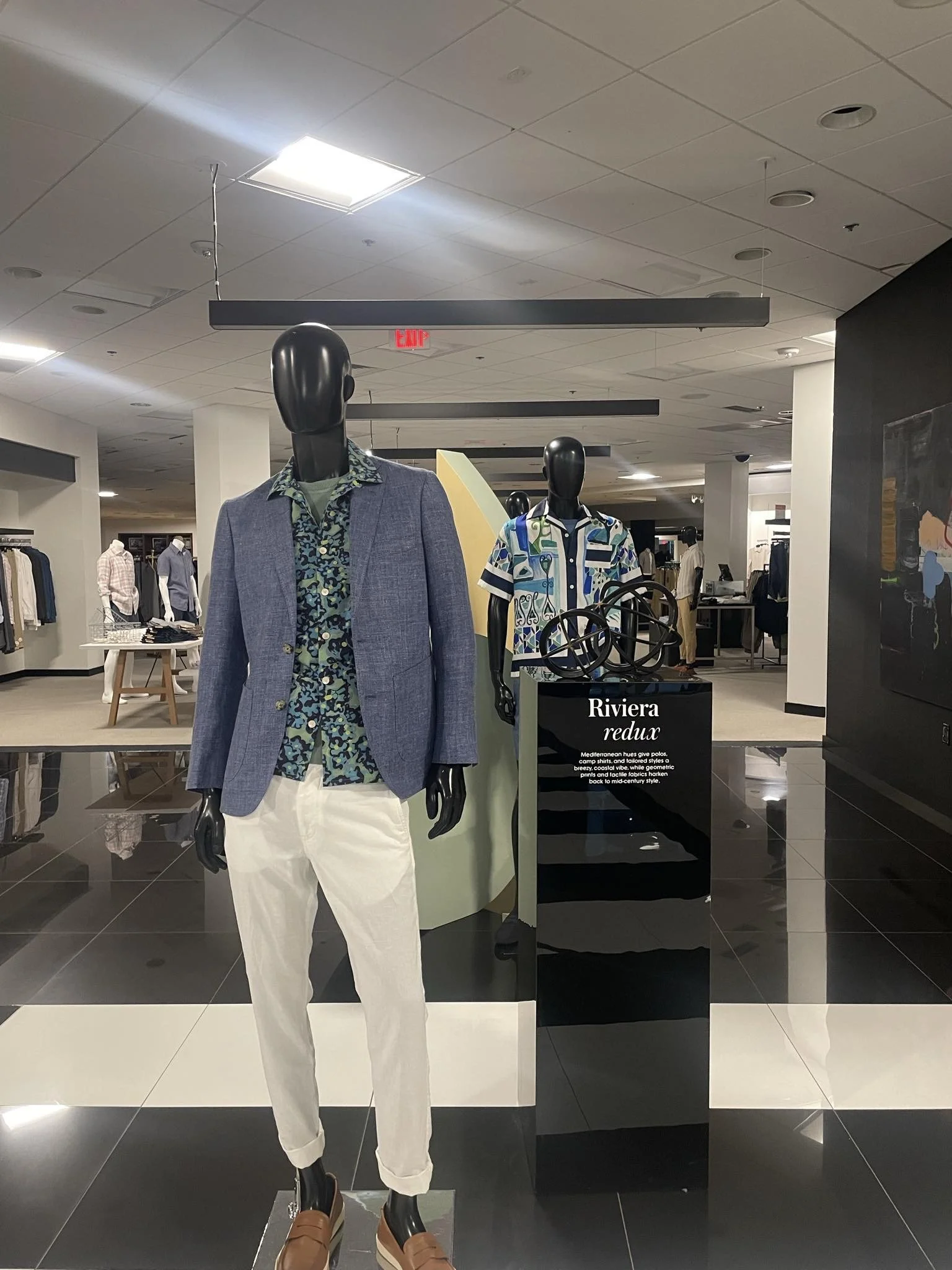
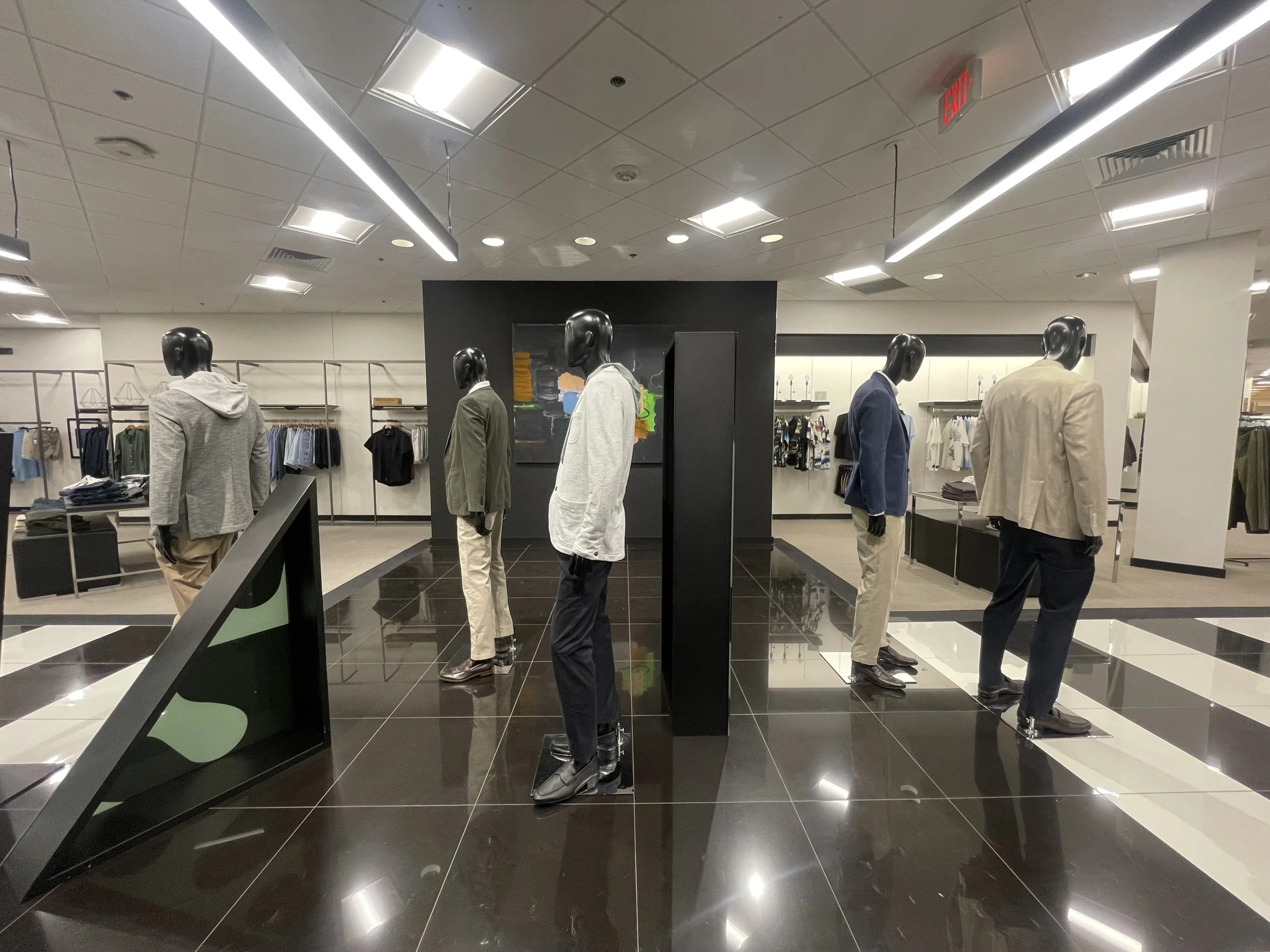
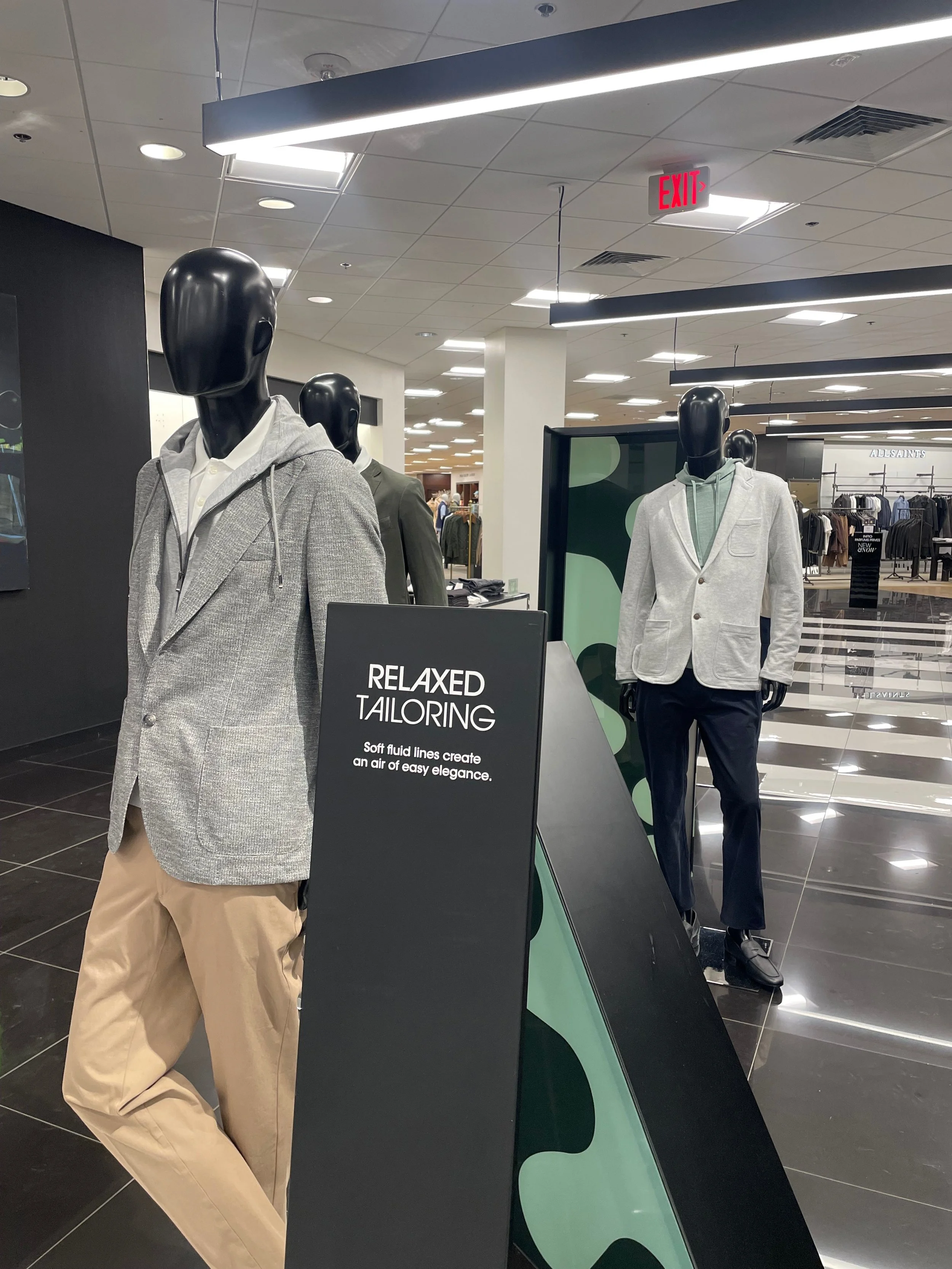
Relaxed Tailoring
“Comfortable, but still professional”, “Casual but making a statement” are two phrases I would use to describe the ‘Relaxed Tailoring’ trend. Down below I have photos of the directive I was given for this display. Showing the color scheme, the company also sent out pastel green vinyl shapes for this display as well.
The first two photos under the visual directive shows what the display looked like before I added the vinyl shapes and the final outcome after. I added the vinyl lettering for the metal plaque, I also dressed/styled all of the mannequins, I picked pieces from Theory, Boss, and Ted Baker to create these looks.


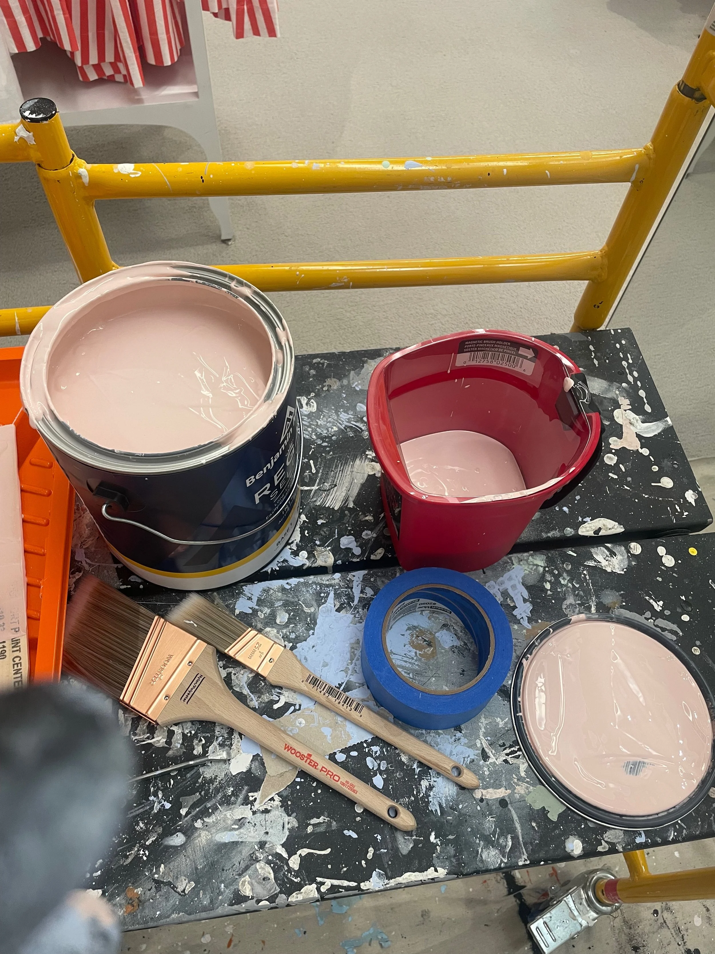
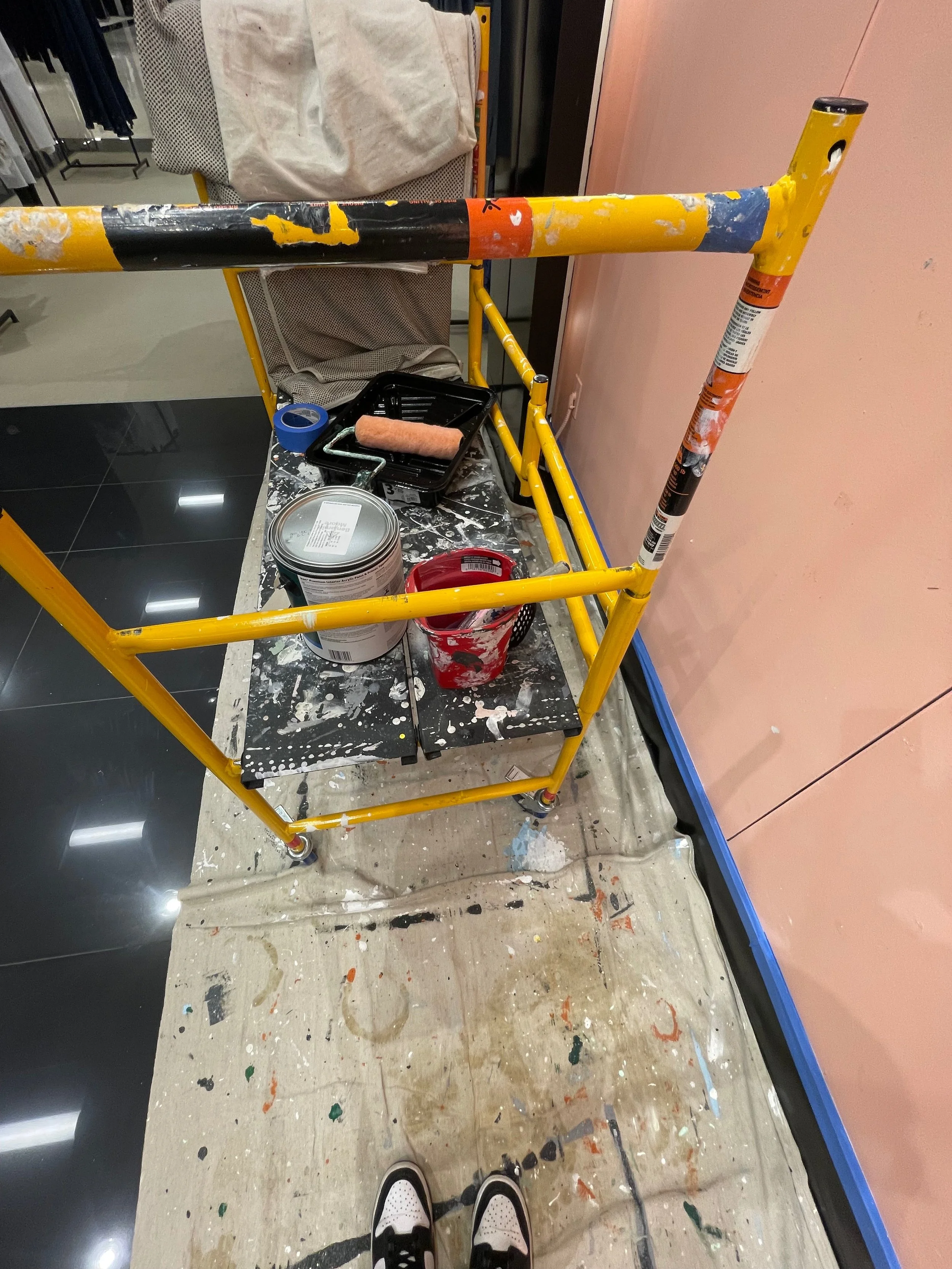
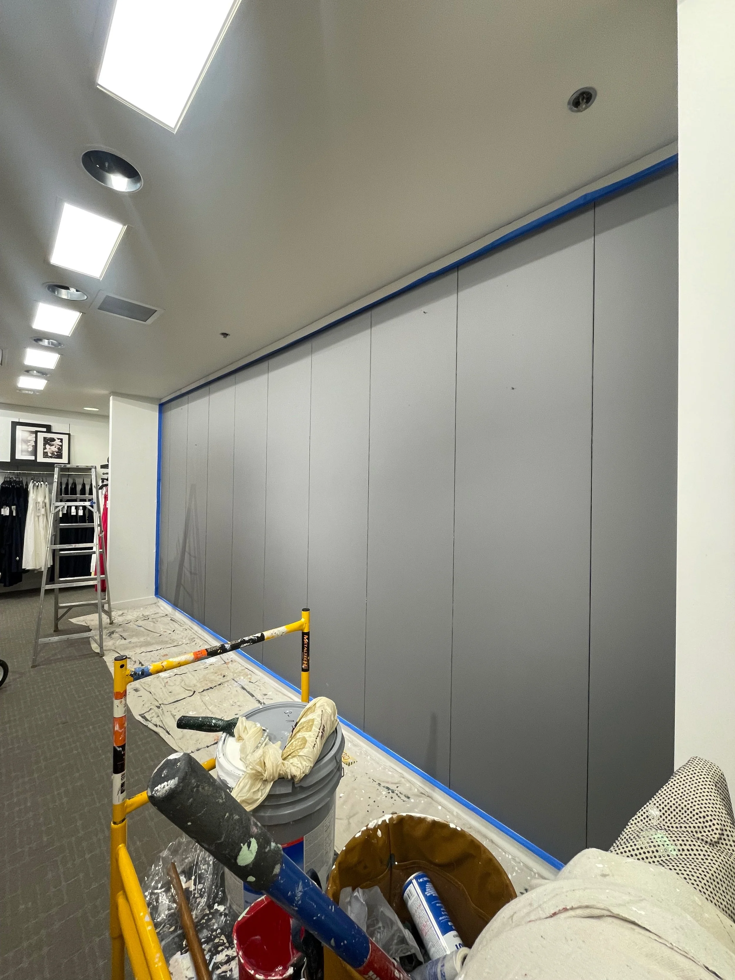
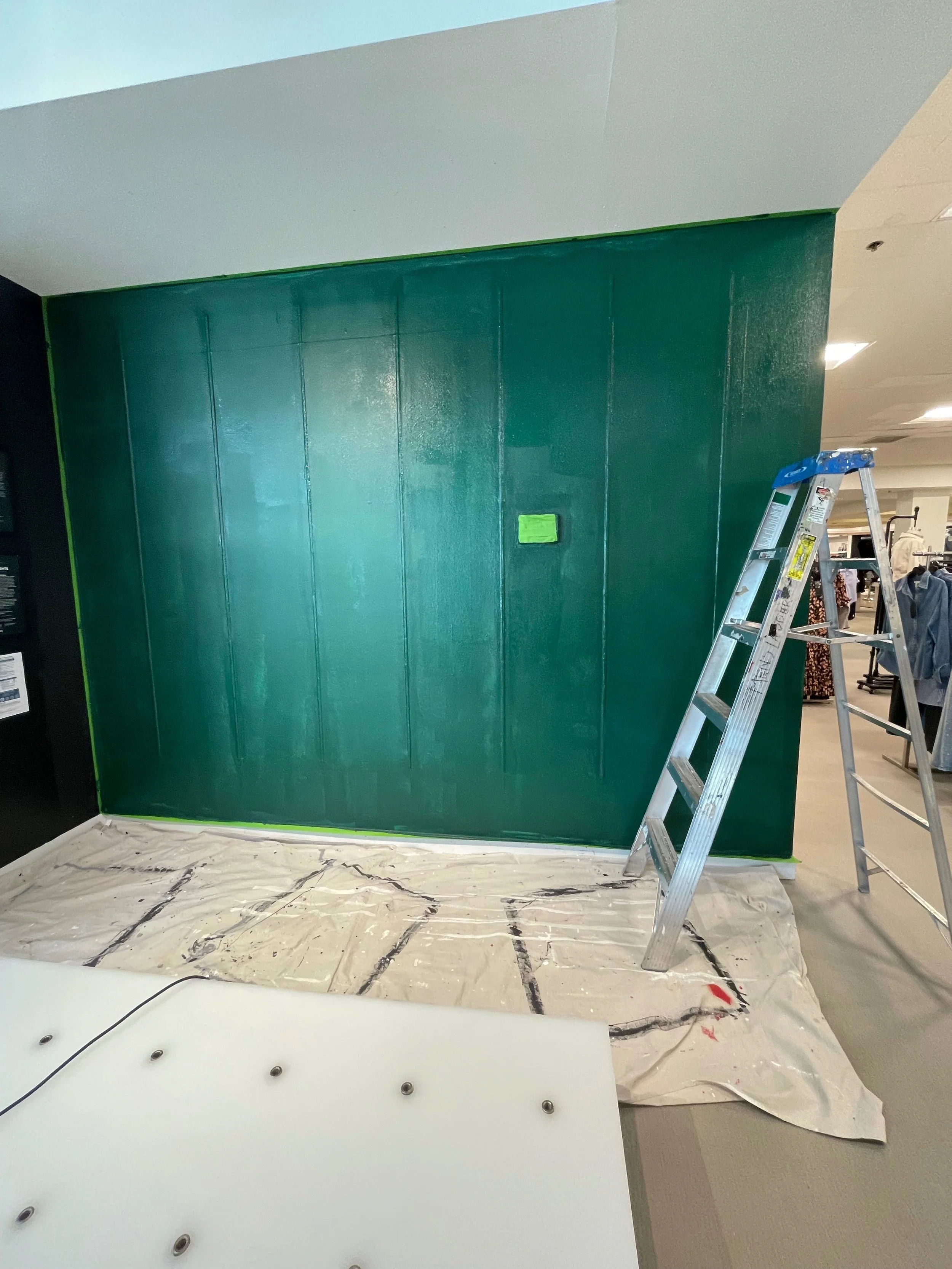
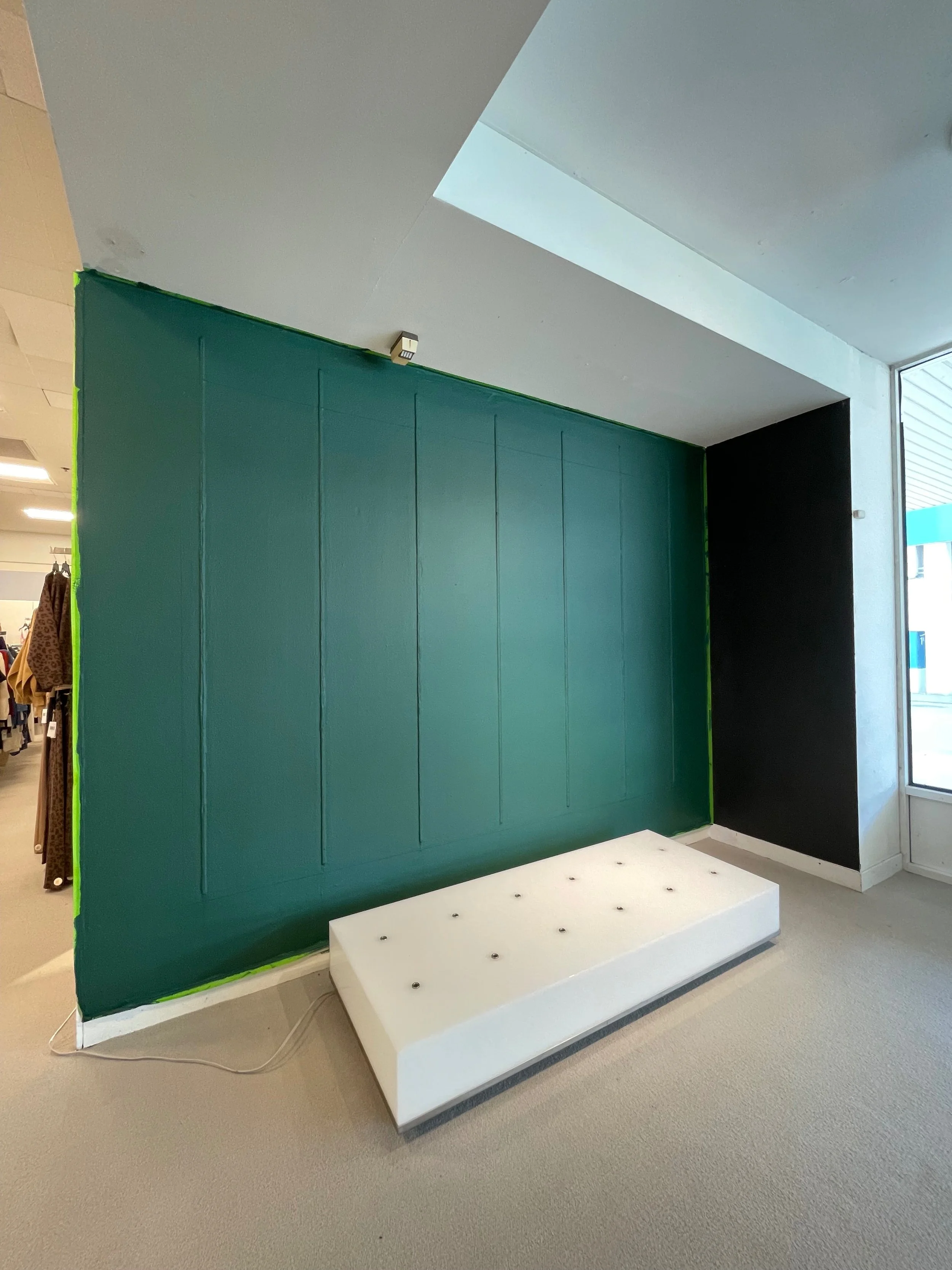
In-Store Paint Projects
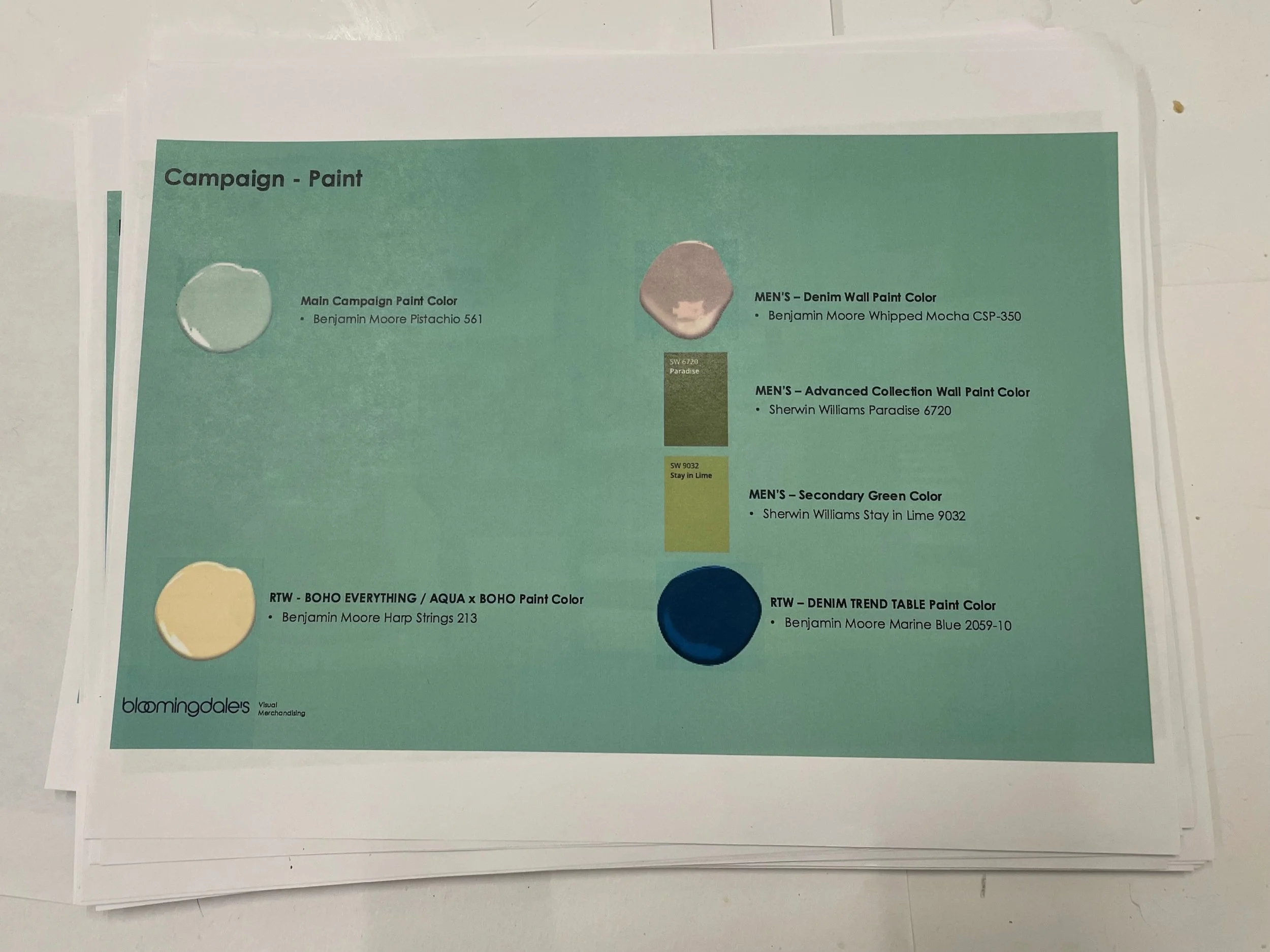
Being a Visual Merchandiser with Bloomingdales has helped enhance my merchandising skills as well as given me the opportunity to take on new visual projects. With new upcoming trends and feedback from instore customer experiences, the company makes different decisions on how to create a more exciting and shoppable environment for the customers. Introducing new paint colors for the walls was one of changes that Bloomingdales came up with to give a fresh new take on the Bloomingdale shopping experience.
Down below are photos and videos of all the walls I’ve painted in store, for both the women’s floor and the men’s floor. This was my first time ever being given the responsibility to paint a wall in a retail space, I gained a new skill and enjoyed the process of doing it. As a graduate student with a Fine Arts background, my goal is to land a position where I can incorporate my visual eye and creativity the way I was able to do here.

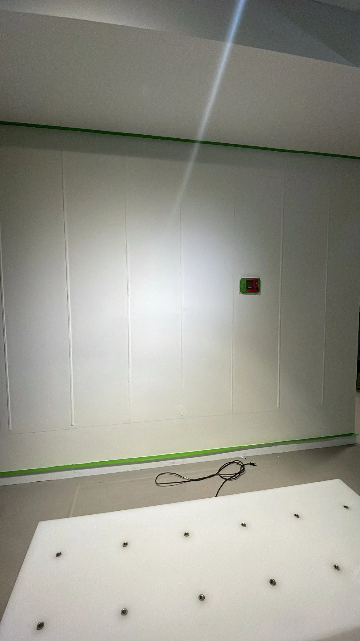
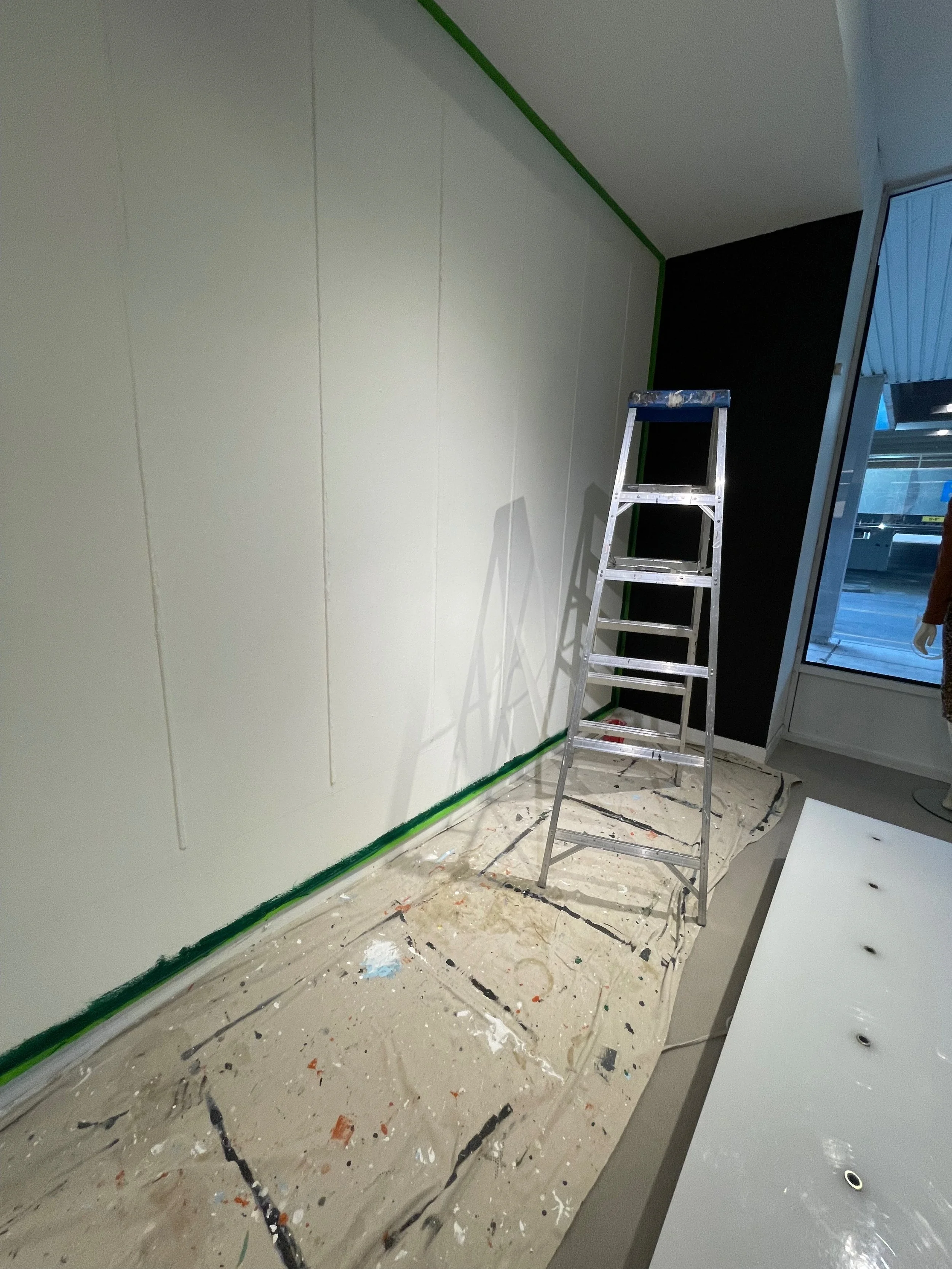
Before
The Process

After
A Fresh New Color
Here are some videos of me during the painting process…
Style Portfolio Color Change
Before

After

After (Different View)
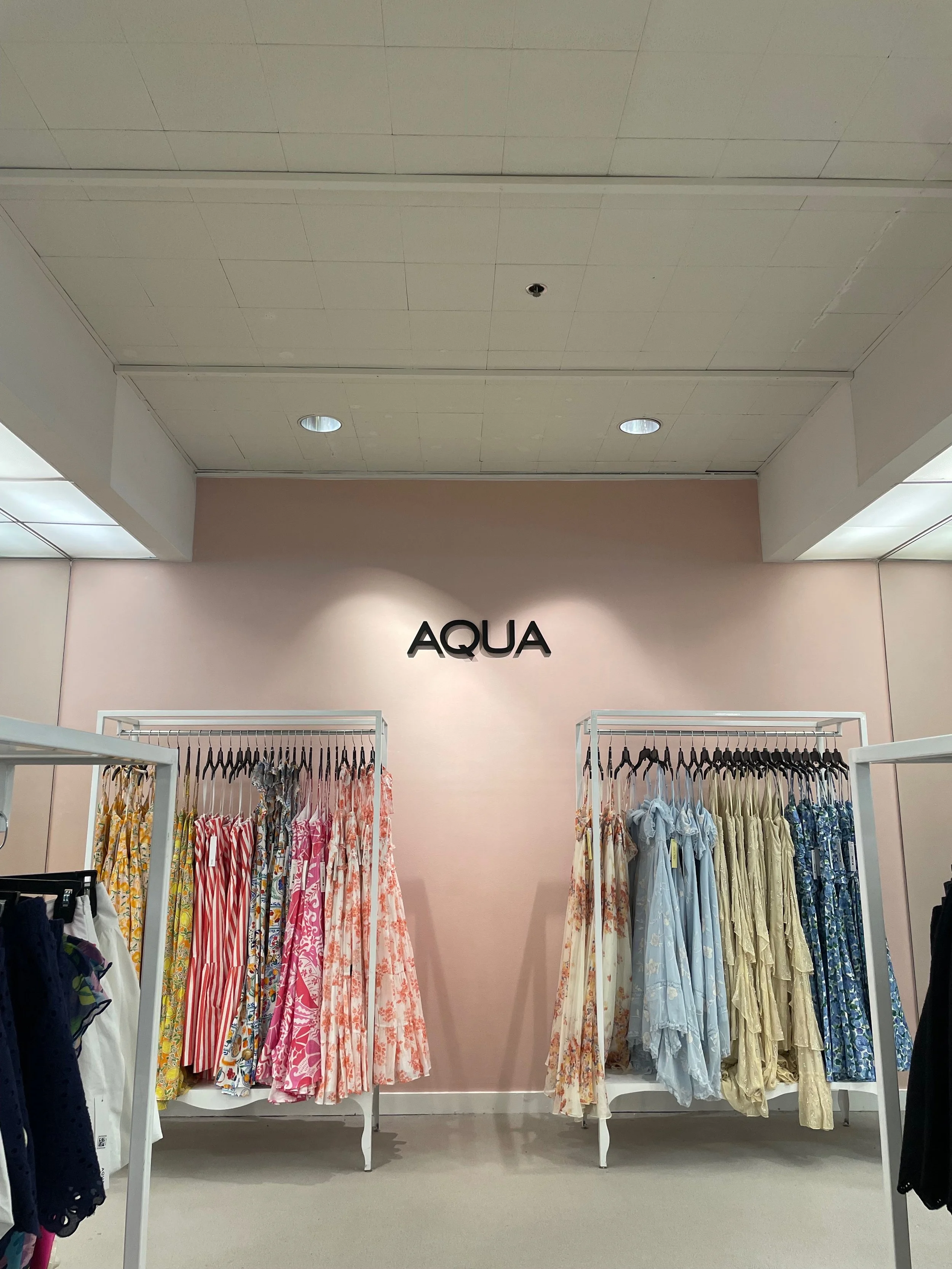
AQUA Color Change
These are videos of me painting one of the walls in the AQUA clothing brand area, the company wanted to give AQUA a new look for the Spring season, down below are some before and after photos.

The Color

The Process
After
Wicked Holiday Season

The Color
Before (Wall #1)
Before (Wall #2)
The Process
After (Wall #1)

After (Wall #2)

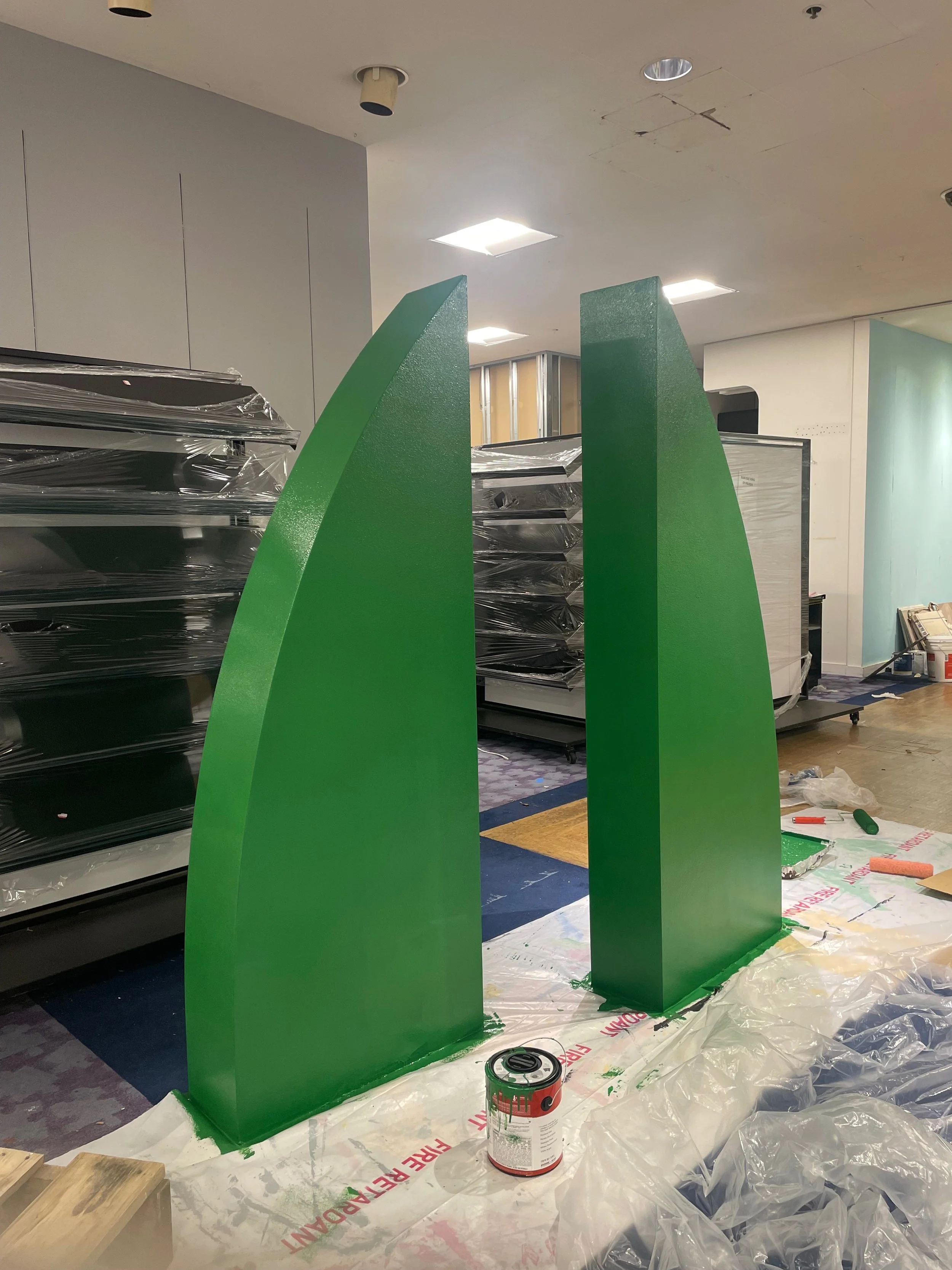
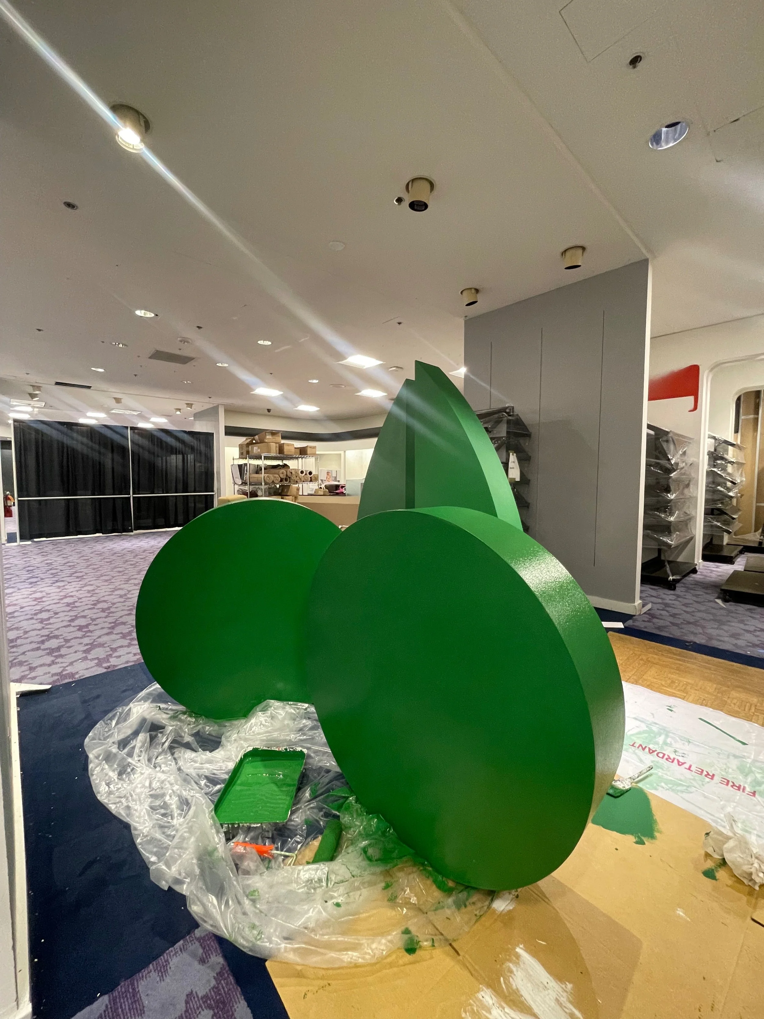
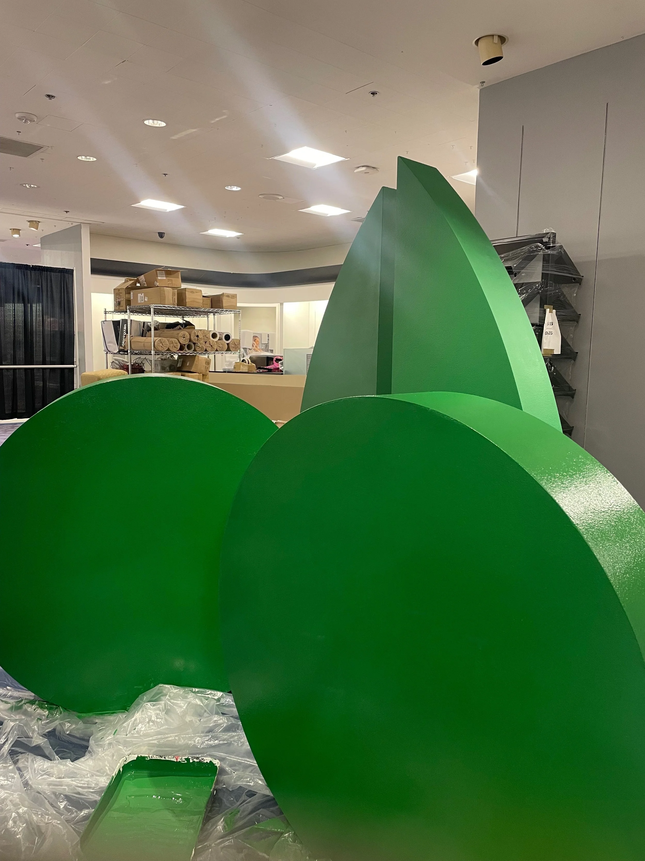
Painting Display Pieces
Here are some photos of these stone shapes that we used for instore display, this was around holiday time so I painted them green to go with the Wicked Trend.

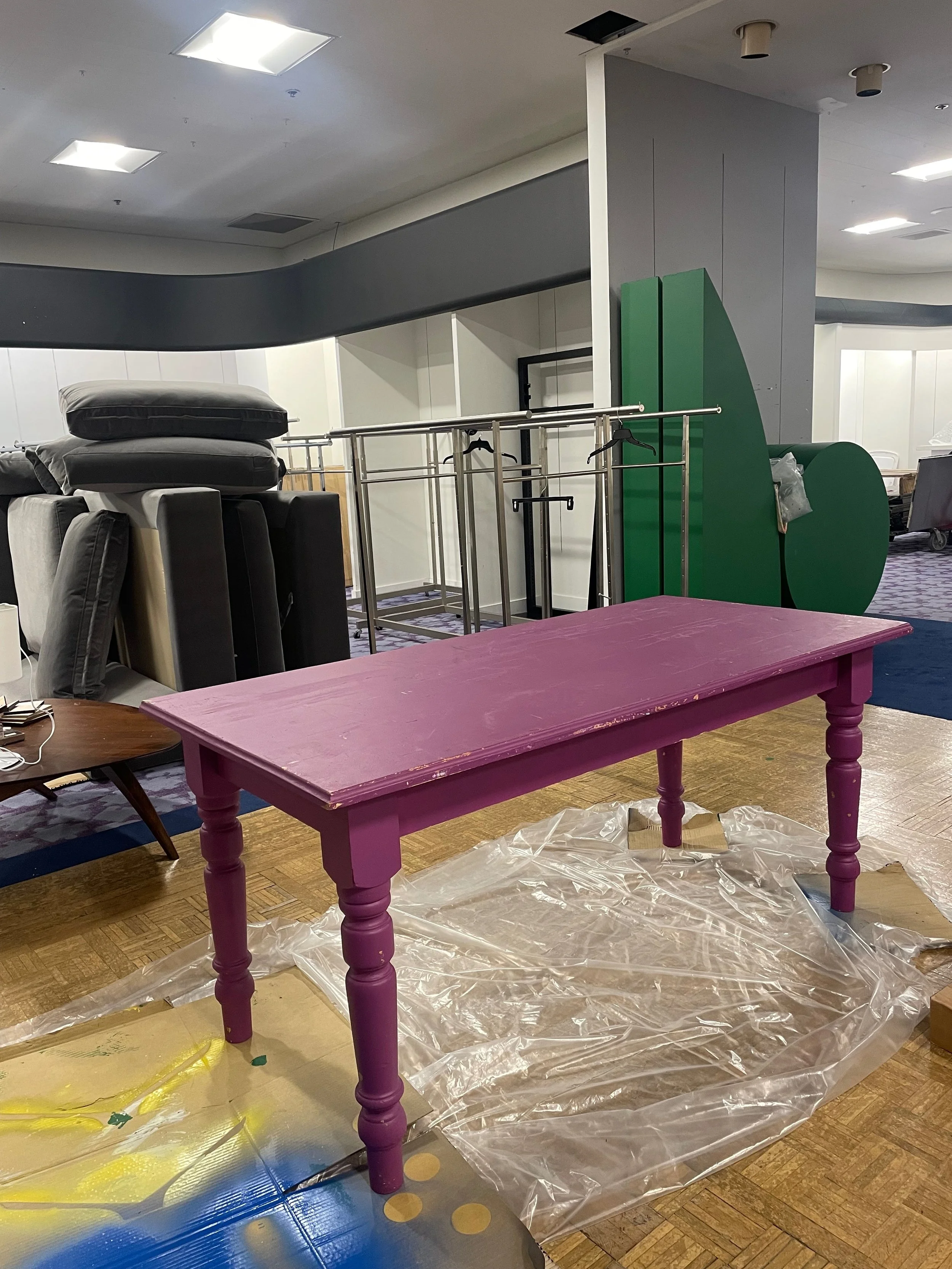
This is a table that I painted for a Spring trend that we had for the brand Sanctuary, I also merchandised the product on the table afterwards.
Close Up View
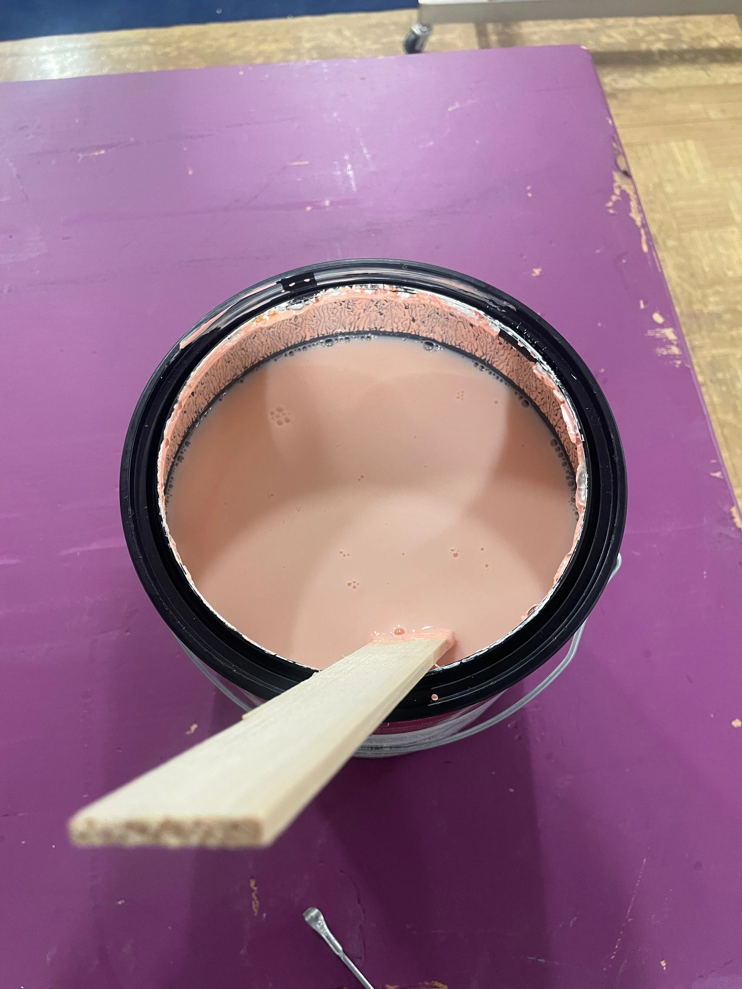
The Color

Before

The Process
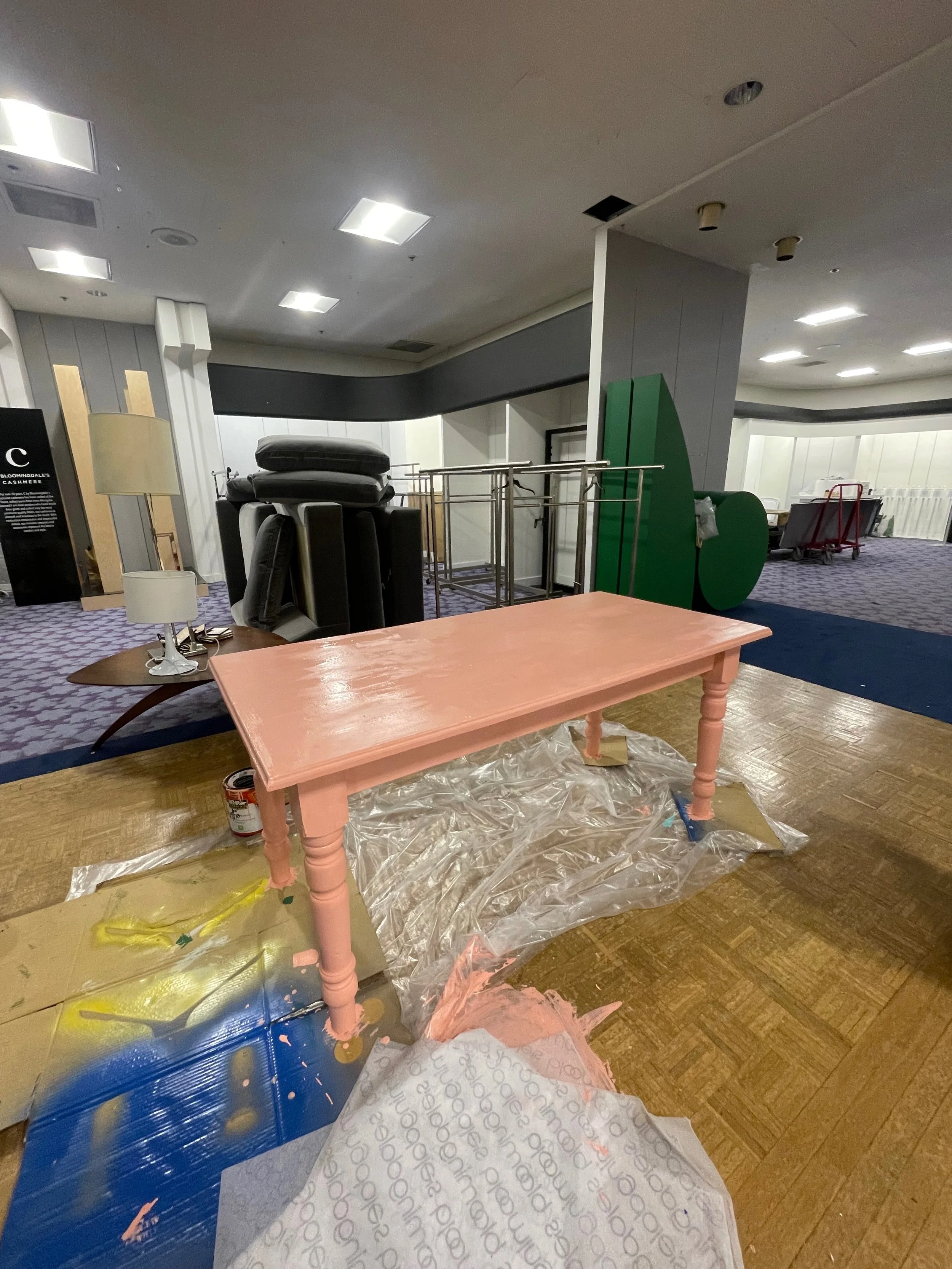
After
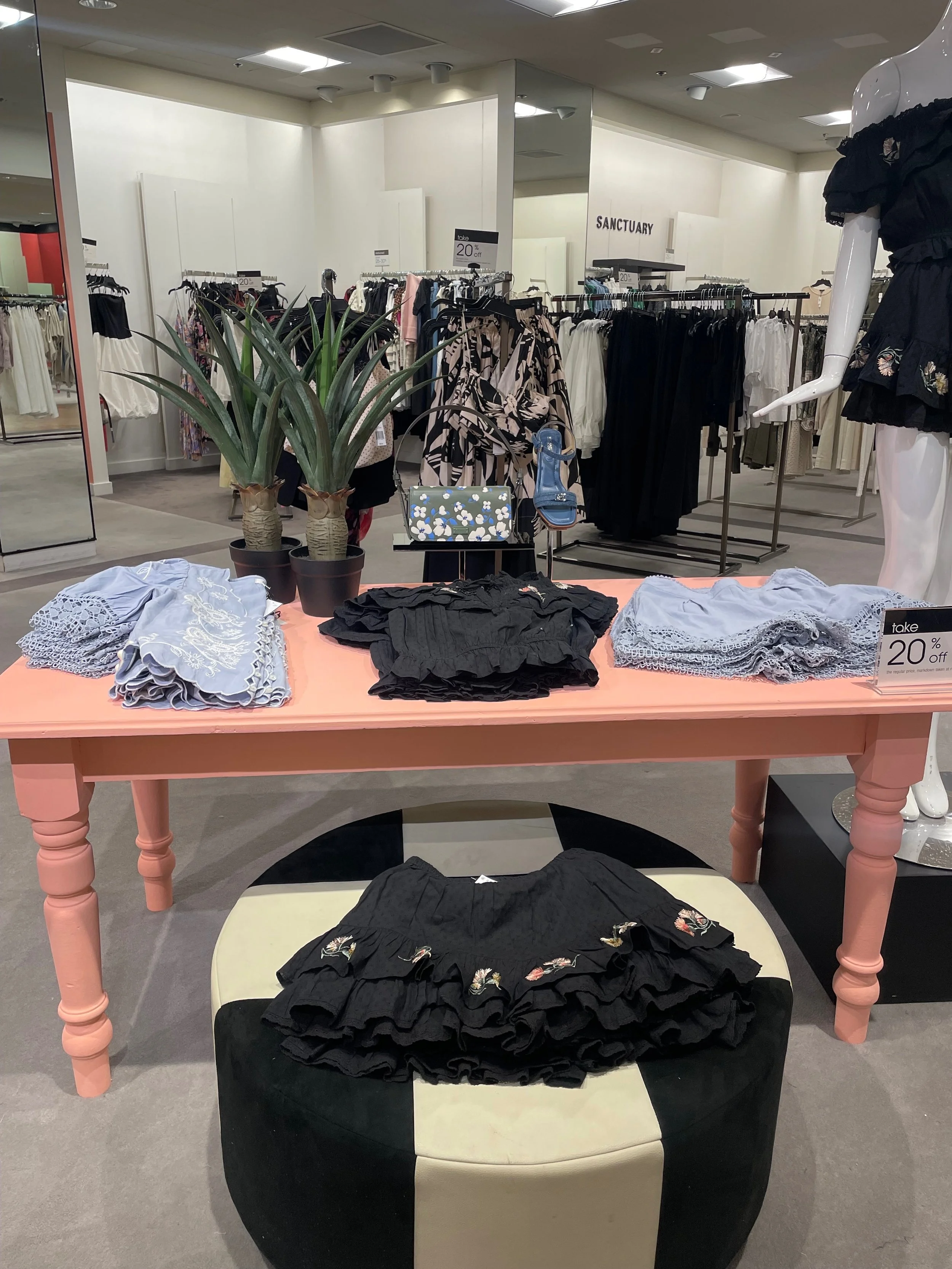
After (Styled & Merchandised)
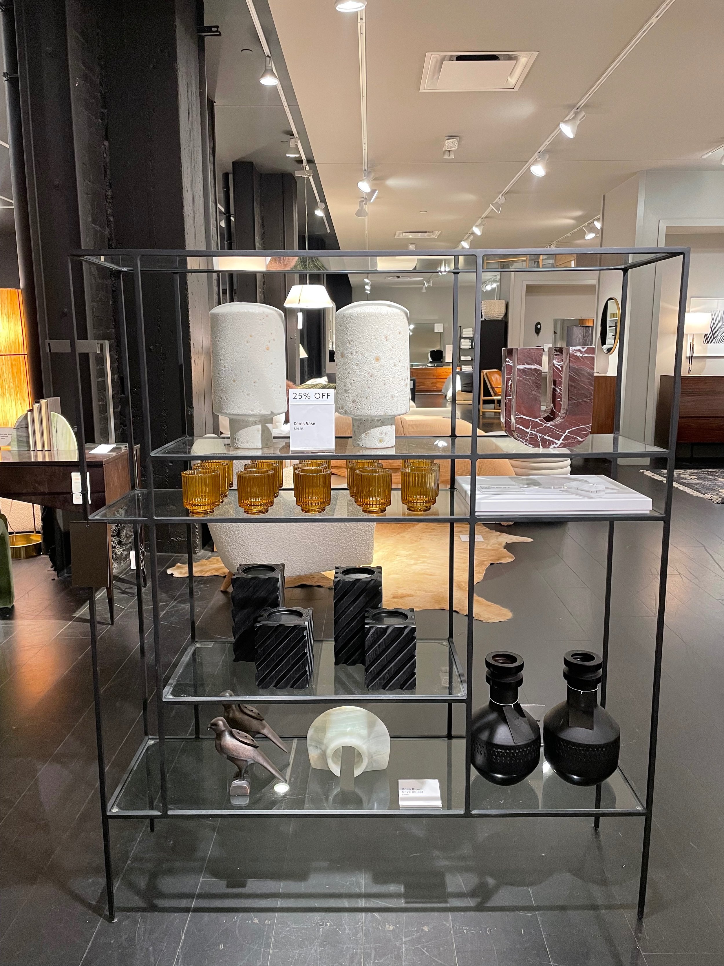
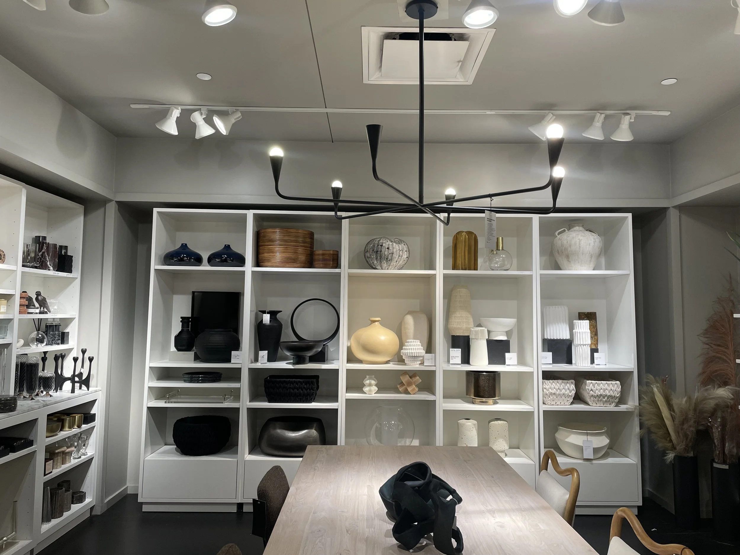
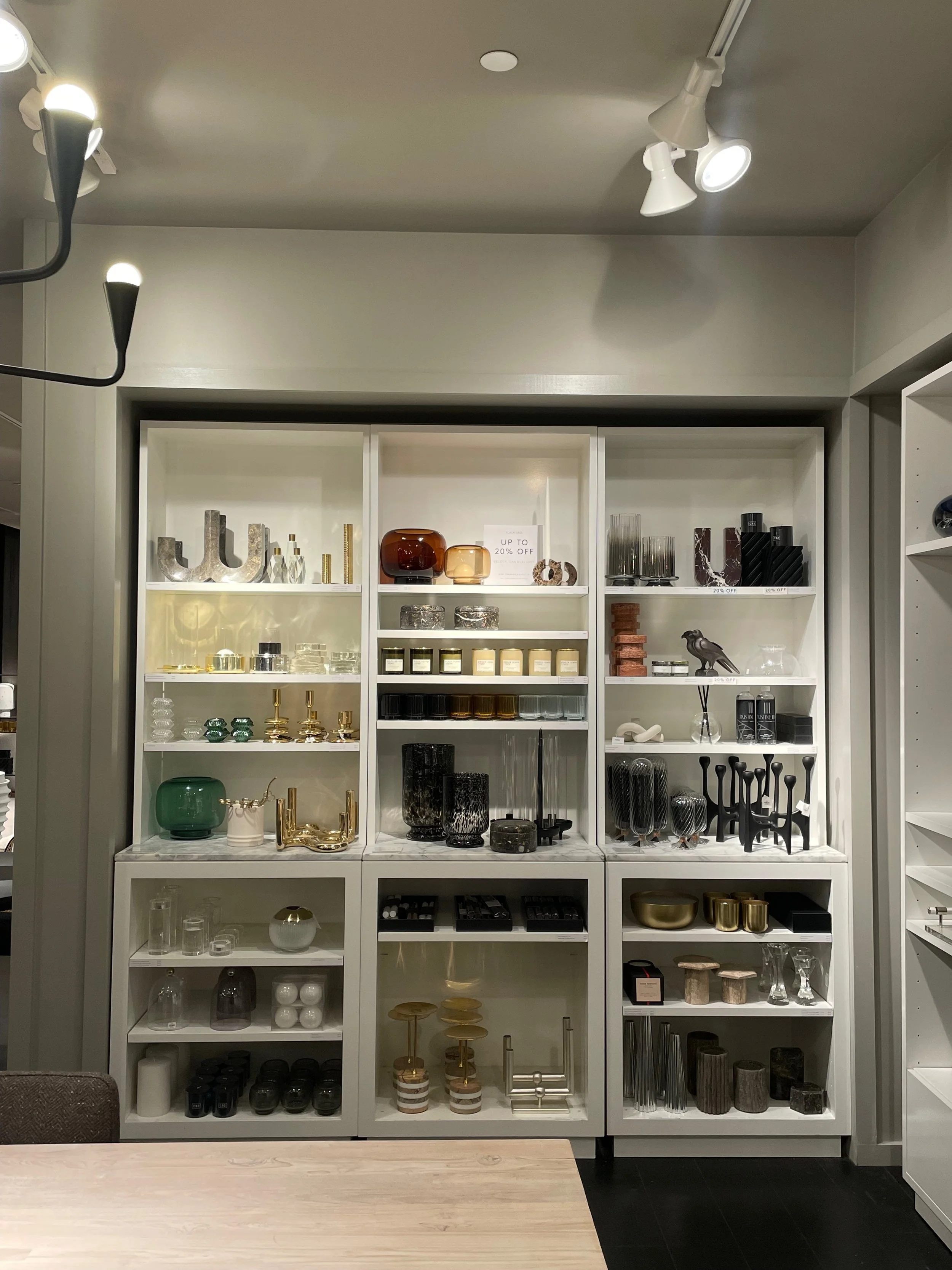
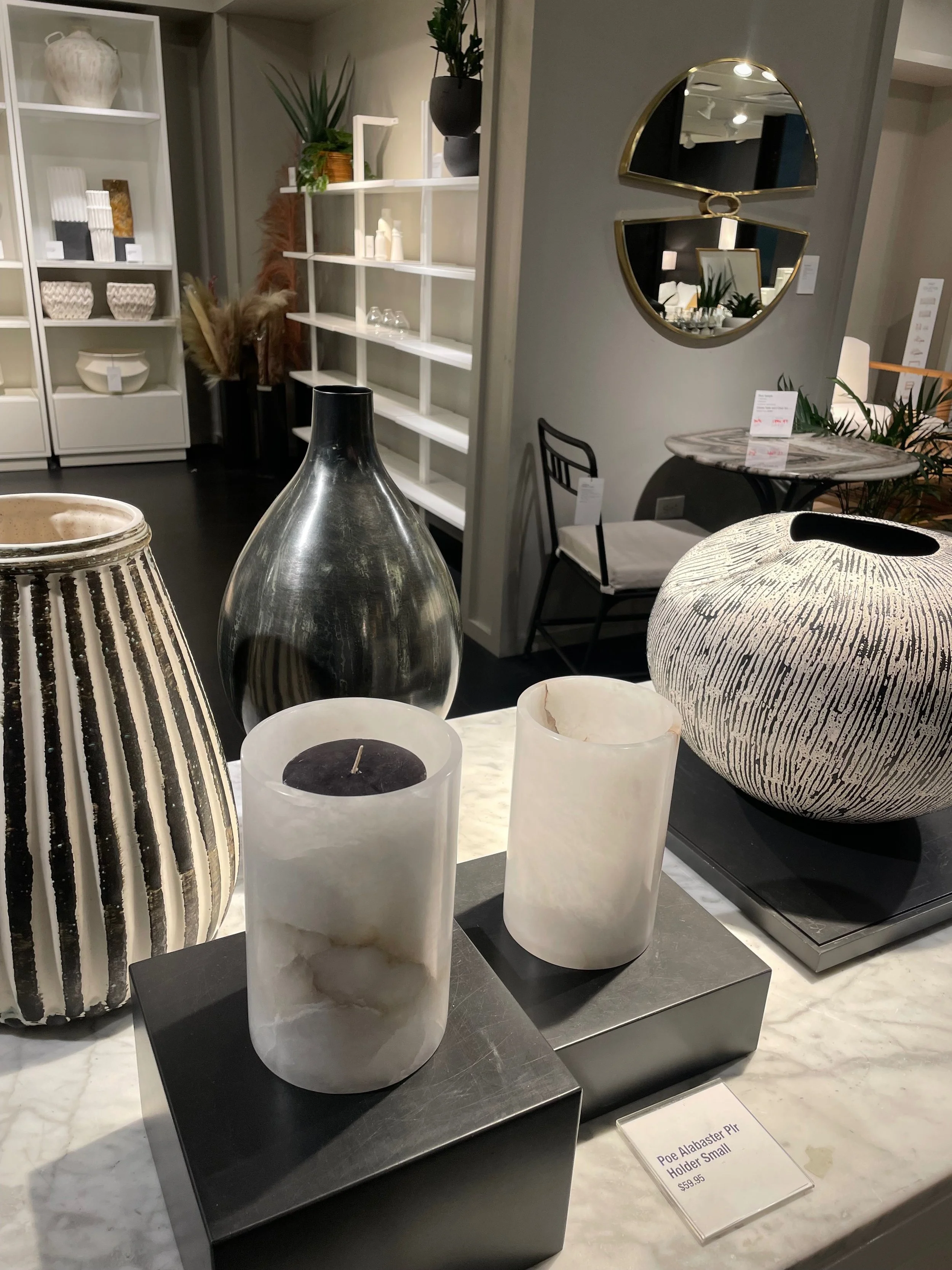
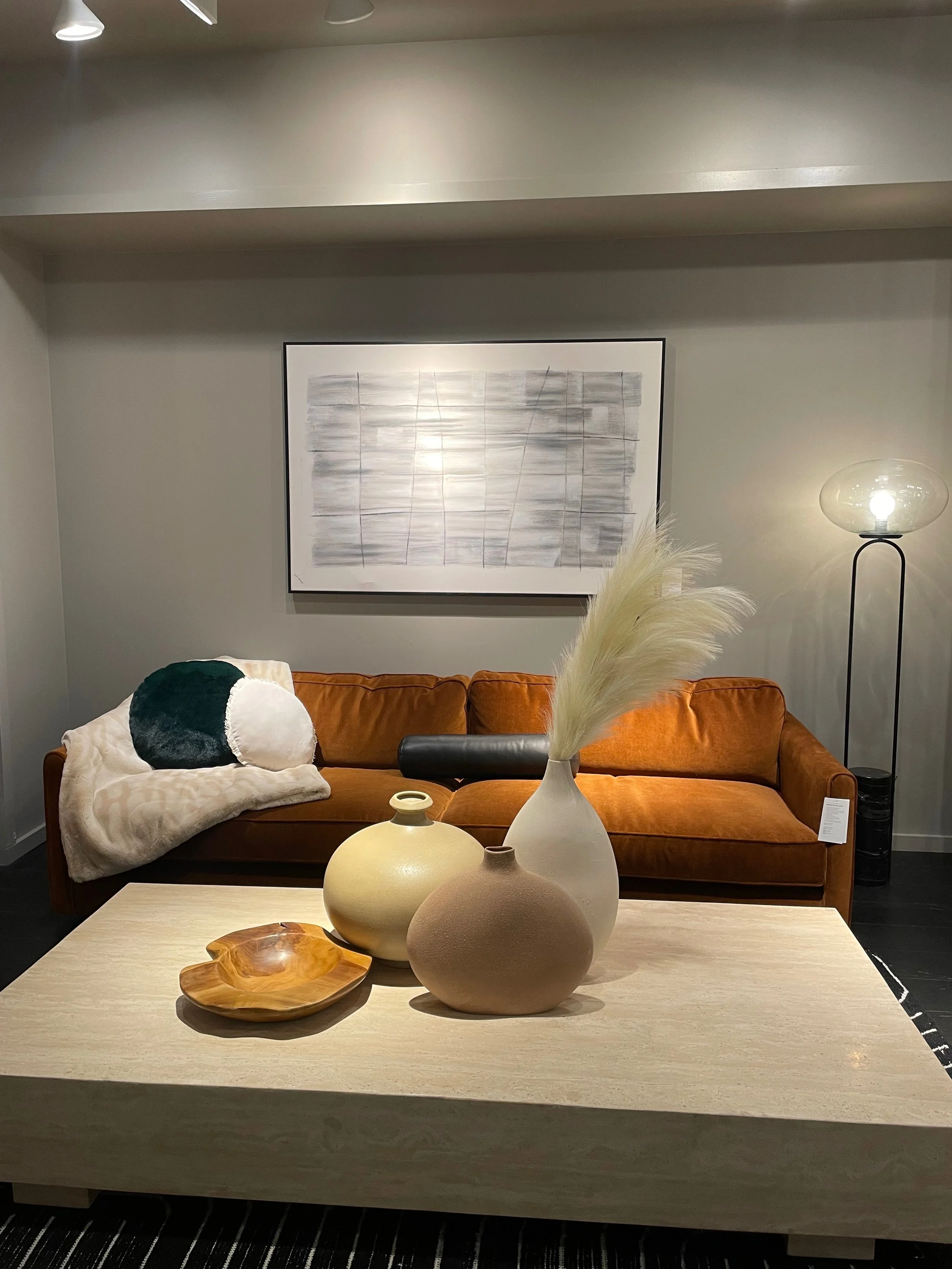
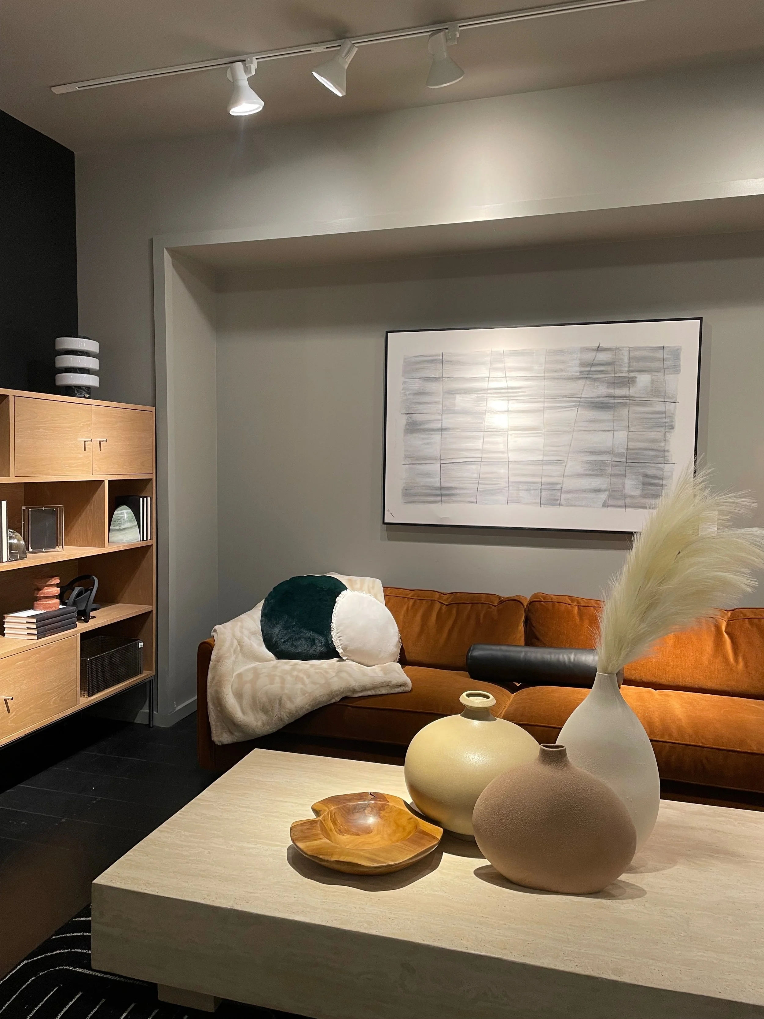
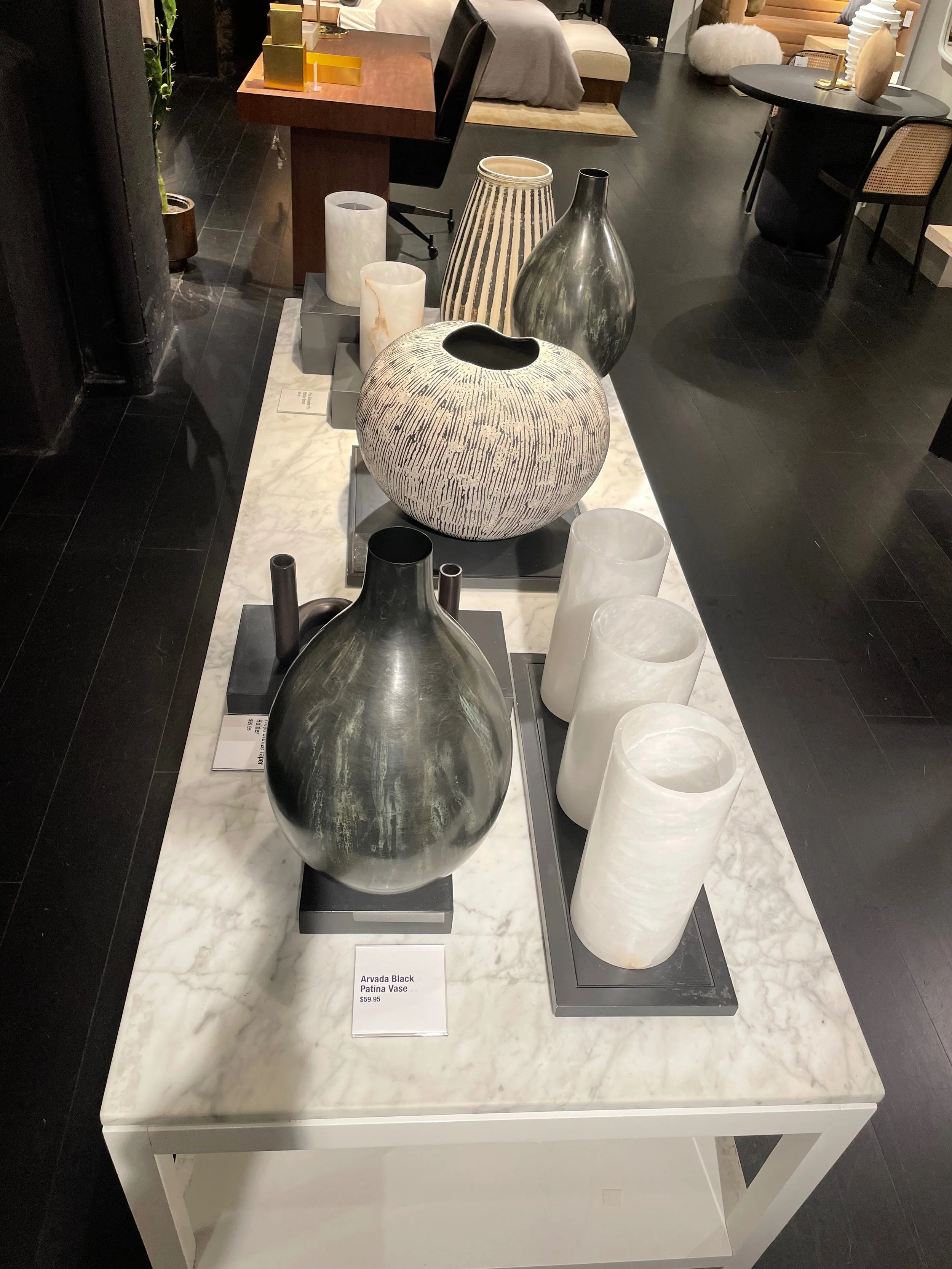
Stock Coordinator
CB2 Philadelphia, PA
March 2020-February 2023
March of 2022 I was hired as the Stock Coordinator for CB2, down below I have some photos of the visual projects/displays that I was given the opportunity to put together, I work with CB2 for a year.
Kept the stock room neat and tidy at all times so that it was easy to access when we needed to pull customer orders
Delegated tasks to my team, ensuring that we working productively and accurately
Worked with the Visual Manager on specific, new & upcoming floor displays, as well as window displays